20 Design Inspirations That Will Revolutionize Your SaaS Pricing Page
September 21, 2024
SaaS Pricing Pages, Subscription Tiers Design

By Sumeet Shroff

Table of Contents
- Slack Pricing Page
- HubSpot Pricing Page
- Notion Pricing Page
- Airtable Pricing Page
- Figma Pricing Page
- Asana Pricing Page
- Trello Pricing Page
- Zoom Pricing Page
- Shopify Pricing Page
- Dropbox Pricing Page
- Zendesk Pricing Page
- Monday.com Pricing Page
- Salesforce Pricing Page
- Mailchimp Pricing Page
- Pipedrive Pricing Page
- Buffer Pricing Page
- Canva Pricing Page
- Squarespace Pricing Page
- Typeform Pricing Page
- Intercom Pricing Page
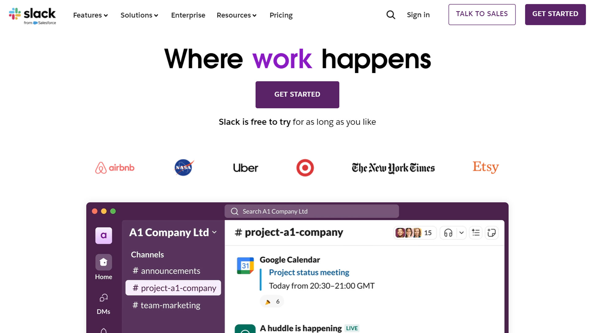
1. Slack Pricing Page
URL: Slack Pricing
Slack’s pricing page is clean and highly intuitive, designed to clearly showcase their four subscription tiers: Free, Pro, Business+, and Enterprise Grid. The page uses a minimalist layout with clear headings and contrasting colors to make navigation easy. Each tier is represented in a card-like layout, providing a clear overview of features in a side-by-side comparison. The use of Slack's signature purple and white color scheme adds to its recognizable branding while keeping the focus on content. Subtle hover effects on pricing cards improve interactivity. The "Learn more" buttons expand to display more details without overwhelming the user. The overall design ensures a smooth decision-making process for potential customers.
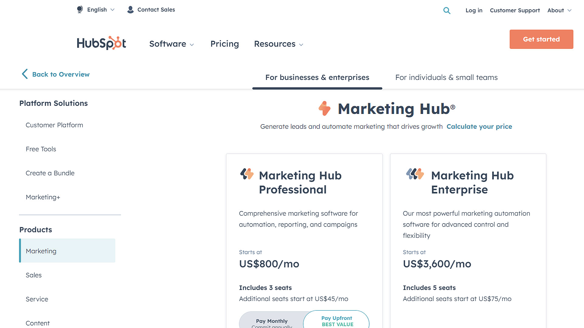
2. HubSpot Pricing Page
URL: HubSpot Pricing
HubSpot's pricing page features a modular pricing design that breaks down its products into four main hubs: Marketing, Sales, Service, and CMS. The layout is designed to give users flexibility, allowing them to mix and match packages to meet their needs. HubSpot uses interactive sliders that let users adjust the number of contacts and see real-time pricing updates. The color strategy involves HubSpot’s orange, white, and light blue, ensuring that important details like discounts and free trial options are highlighted. The page is incredibly transparent about costs, offering potential customers confidence and clarity in their purchasing decisions. The page uses tooltips to provide additional information without cluttering the layout.
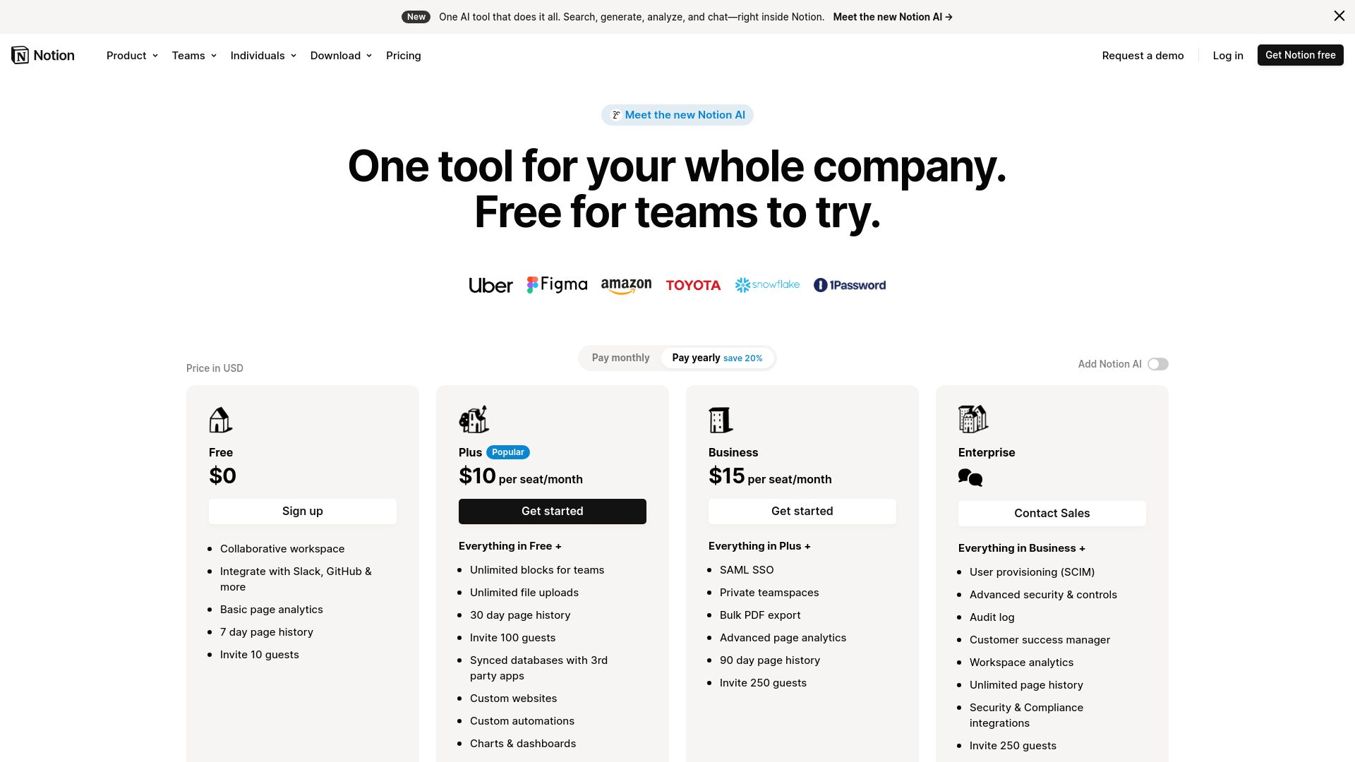
3. Notion Pricing Page
URL: Notion Pricing
Notion's pricing page showcases its four-tier pricing plan: Free, Plus, Business, and Enterprise, using a simple yet effective card system. The design embraces a minimalist black and white aesthetic, which is consistent with Notion’s overall design philosophy. The page is structured to be visually appealing without overwhelming the user. Key features for each plan are bulleted out, and a subtle gray highlight separates different pricing tiers. The page includes concise descriptions for each plan, and the comparison table at the bottom makes it easier to differentiate between plans. This approach ensures clarity while keeping a modern and professional look.
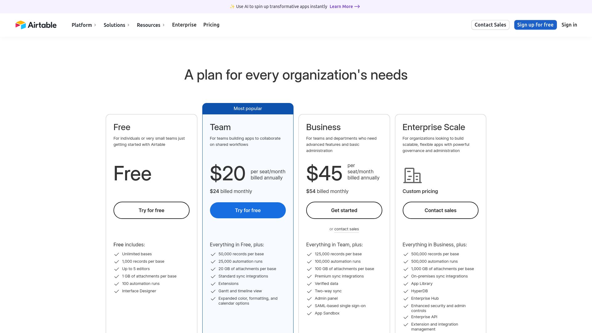
4. Airtable Pricing Page
URL: Airtable Pricing
Airtable’s pricing page effectively uses a clean, grid-based layout that showcases four pricing tiers: Free, Plus, Pro, and Enterprise. Each tier is represented by a column, making the side-by-side comparison of features seamless. The page is heavy on visual hierarchy, with headers in bold, and the call-to-action buttons (e.g., “Try for free”) using a contrasting teal color to draw attention. It is easy to navigate due to the clean white background and ample whitespace around the content. Airtable makes great use of icons and badges to highlight popular features in each plan. The focus is on clarity, ensuring users can make a quick, informed decision.
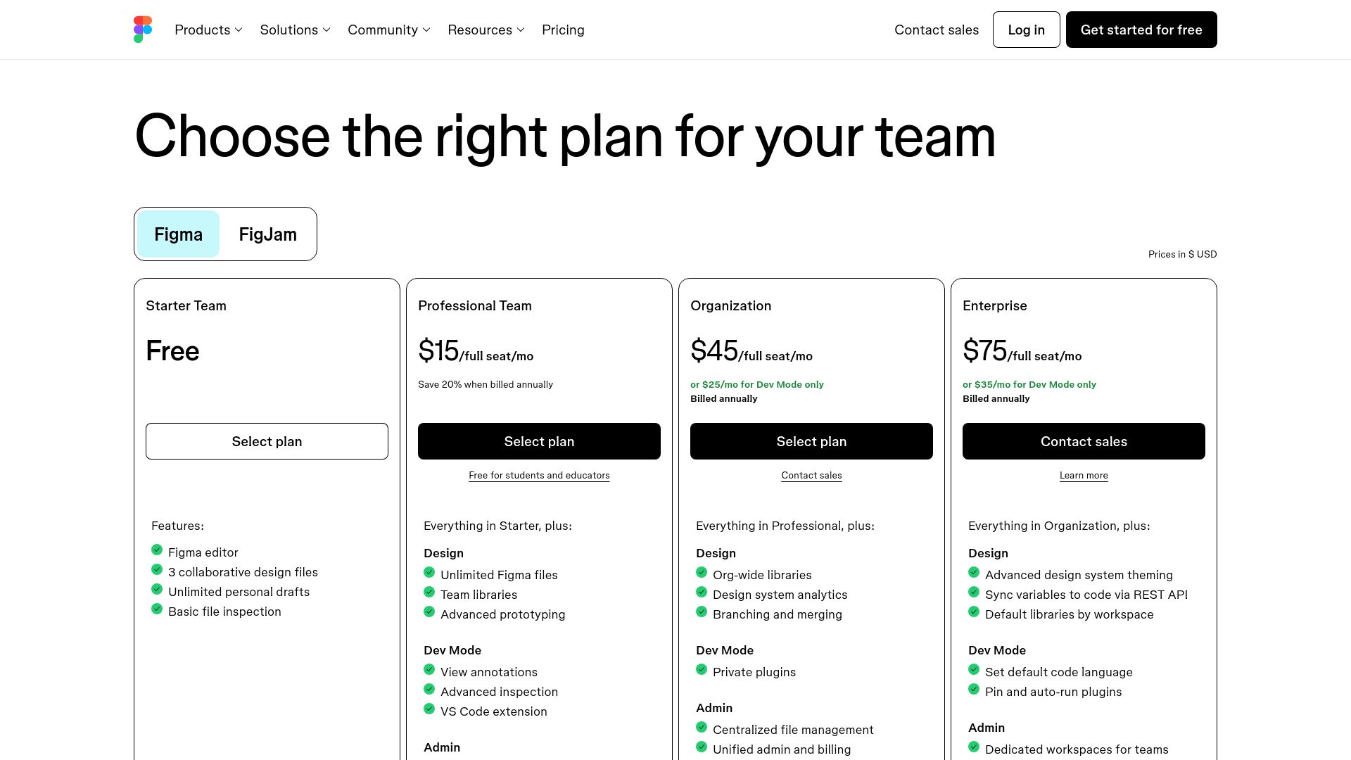
5. Figma Pricing Page
URL: Figma Pricing
Figma's pricing page is modern and elegant, highlighting four key plans: Starter, Professional, Organization, and Enterprise. The bold typography and neutral colors create a professional feel, while the use of interactive elements such as expandable sections for additional information keeps the page clean. The layout uses a card system, with each plan displayed in its own box, making it easy to compare the features. The page emphasizes collaboration by including customer testimonials and industry endorsements. The use of icons to represent key features adds visual interest and enhances readability, allowing users to quickly digest the information.
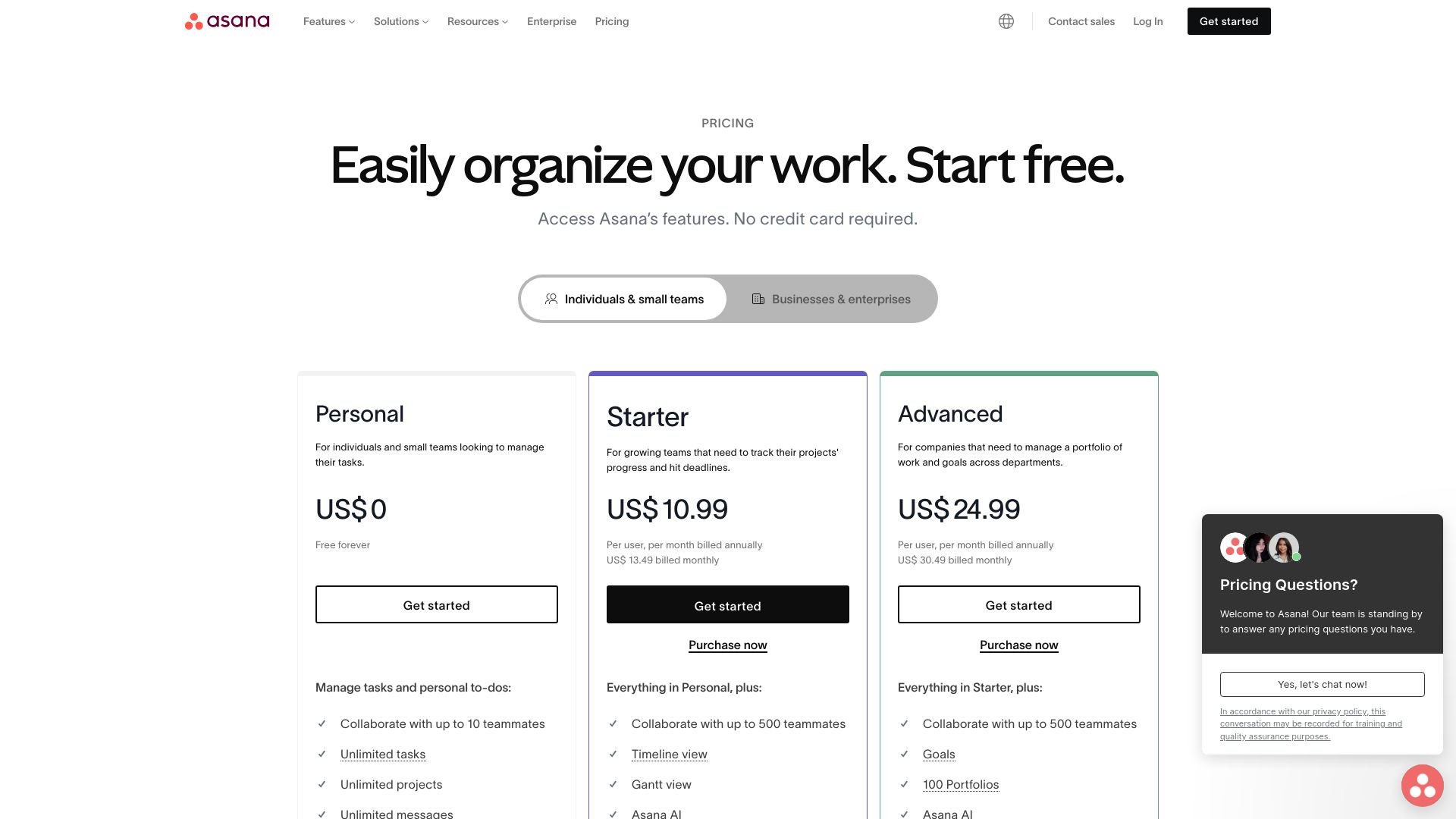
6. Asana Pricing Page
URL: Asana Pricing
Asana’s pricing page presents a well-organized and user-friendly layout that guides the user through its four pricing tiers: Basic, Premium, Business, and Enterprise. The page has a structured grid design with clear headings, well-spaced columns, and a consistent blue and white color palette. Asana emphasizes feature comparison, with each plan having a detailed breakdown of its core features in a table format. The hover animations and sticky headers ensure a smooth user experience. Key features are highlighted in bold, helping users make informed choices. The use of subtle graphics and icons keeps the design interesting without overwhelming users with too much information.
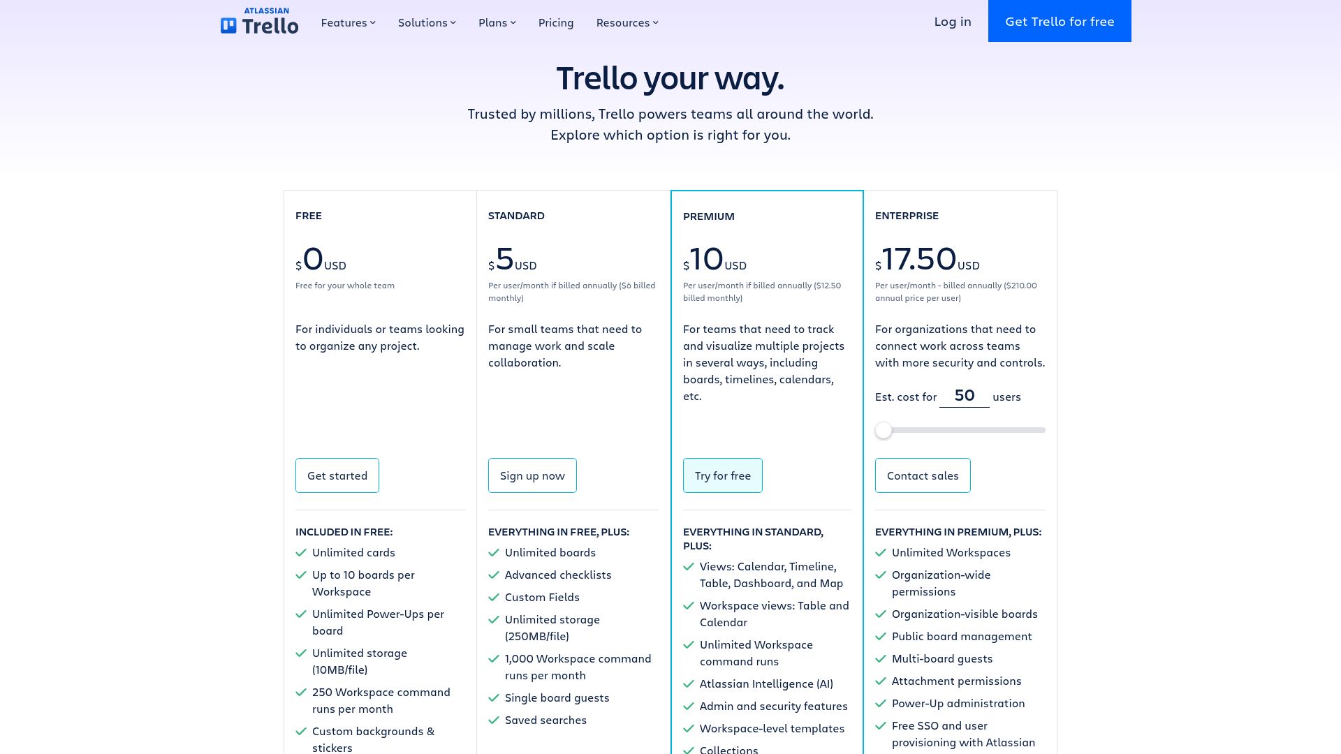
7. Trello Pricing Page
URL: Trello Pricing
Trello's pricing page is simple, visual, and to the point. It showcases four plans: Free, Standard, Premium, and Enterprise. Each plan is presented in a color-coded card format, with the Standard and Premium options being highlighted in a light blue to show they're popular. The pricing is upfront, and the features are clearly listed below each plan, making it easy to compare offerings. The page emphasizes action with prominent "Get Started" buttons for each tier. Trello also includes detailed tooltips for users who want more information on specific features, which appear when users hover over certain icons or text.
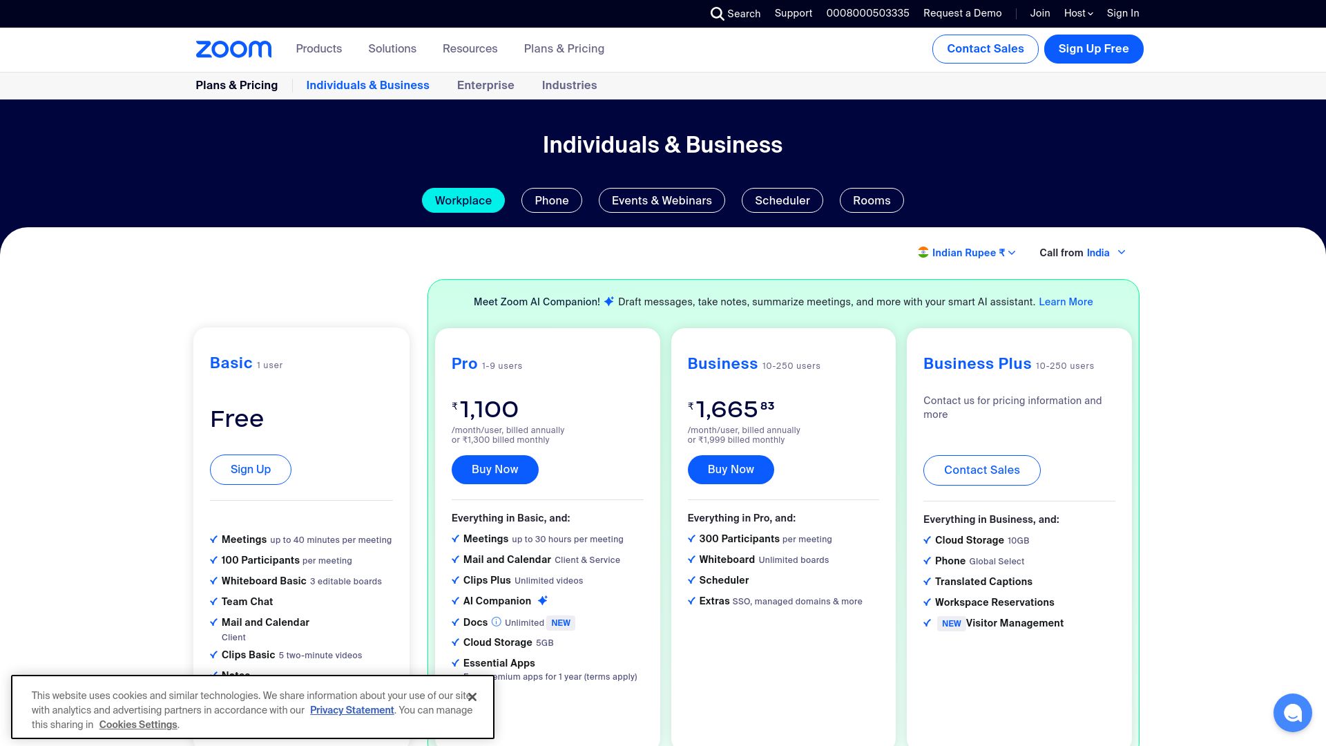
8. Zoom Pricing Page
URL: Zoom Pricing
Zoom’s pricing page emphasizes simplicity and ease of understanding with its four-tier structure: Basic, Pro, Business, and Enterprise. Each plan is presented in a side-by-side column layout with features neatly categorized. Zoom uses a consistent blue and white color palette to maintain its brand identity, while subtle pops of color are used for call-to-action buttons like "Buy Now." The page employs a responsive design that adjusts beautifully for mobile, ensuring a great user experience across devices. The plan comparison table at the bottom adds further depth to help users distinguish between their options based on key features like meeting length and participant capacity.
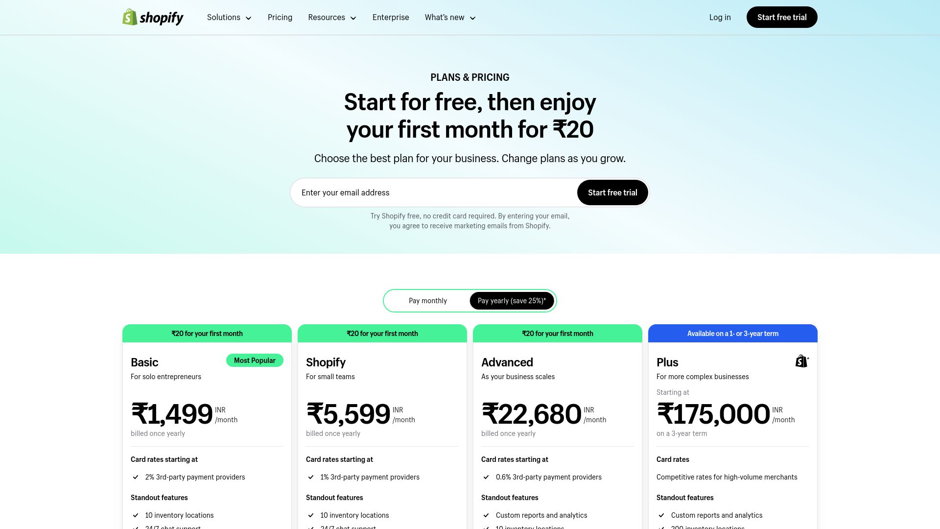
9. Shopify Pricing Page
URL: Shopify Pricing
Shopify's pricing page is designed with conversion in mind, showcasing three clear plans: Basic, Shopify, and Advanced. The green color scheme stays consistent with Shopify's branding, making the page both visually appealing and familiar to its users. Each plan is represented in vertical columns with bold headings, pricing, and plan highlights clearly displayed. A helpful comparison table is included below the plans for users to explore more detailed features. The design focuses on simplicity, with prominent call-to-action buttons like "Start free trial" in bold green. Icons are used sparingly to highlight key features, enhancing the clarity of the page.
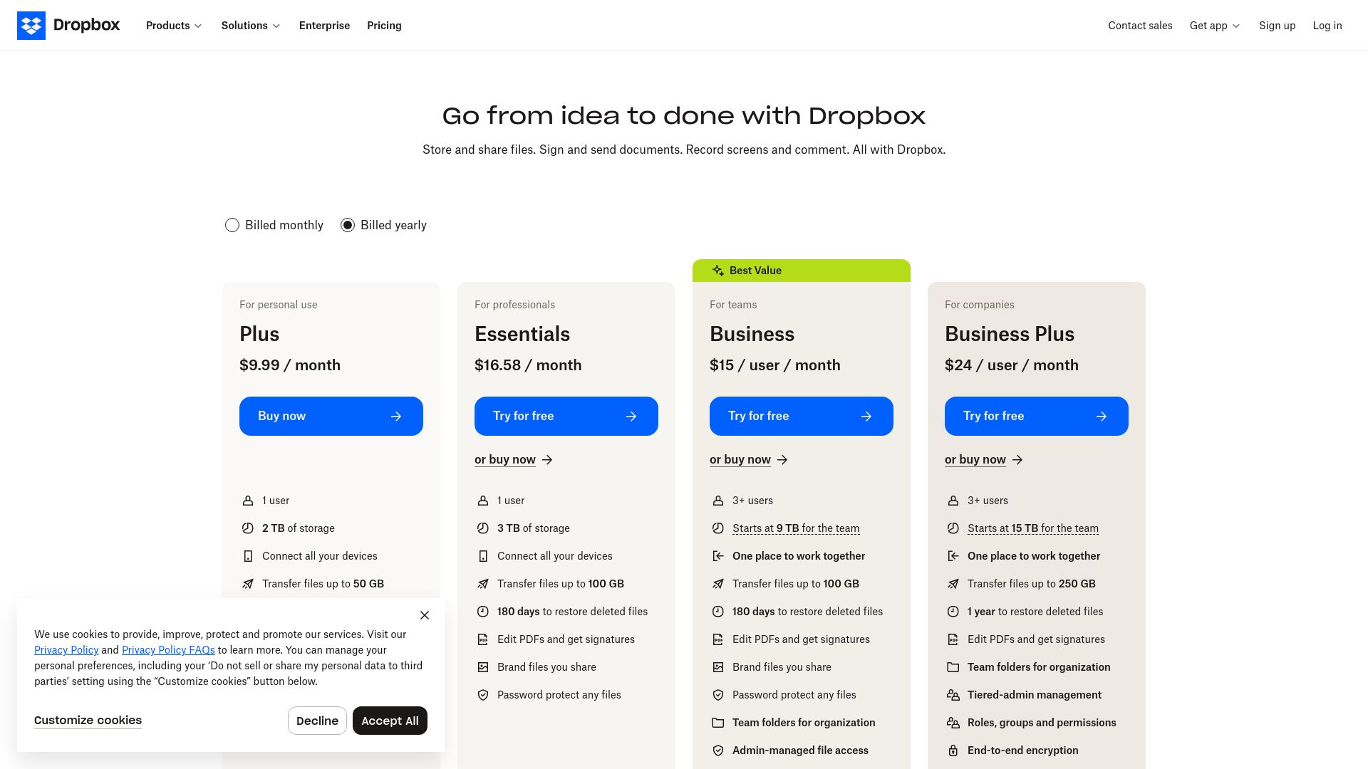
10. Dropbox Pricing Page
URL: Dropbox Pricing
Dropbox’s pricing page is known for its minimalist and clean layout, reflecting the brand's simplicity. The page offers four subscription tiers: Basic, Plus, Family, and Professional. Each plan is presented in a horizontal layout, making it easy for users to scan across the options. Dropbox uses calming blue and white colors, with pricing and features in bold text for clarity. Call-to-action buttons like "Buy Now" and "Try for free" are in a contrasting blue color to draw attention. A section highlighting additional services adds depth to the page, making it both informative and conversion-focused.
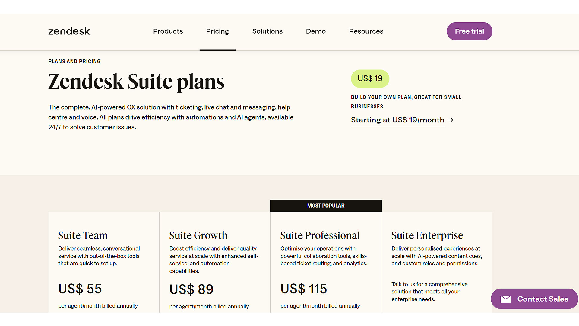
11. Zendesk Pricing Page
URL: Zendesk Pricing
Zendesk’s pricing page is an excellent example of efficient SaaS subscription tier design. It features five pricing tiers: Suite Team, Suite Growth, Suite Professional, Suite Enterprise, and an additional custom Enterprise plan. The layout employs a horizontal grid system, making it easy to compare features across plans. Each plan is presented in a sleek blue and white card format, with a clear breakdown of features underneath each pricing point. The design's consistency makes it easy to navigate, with a strong emphasis on user experience through prominent call-to-action buttons and helpful tooltips that provide extra information about each feature. Zendesk also uses bold typography to highlight critical features, ensuring potential customers can easily spot the value in each subscription.
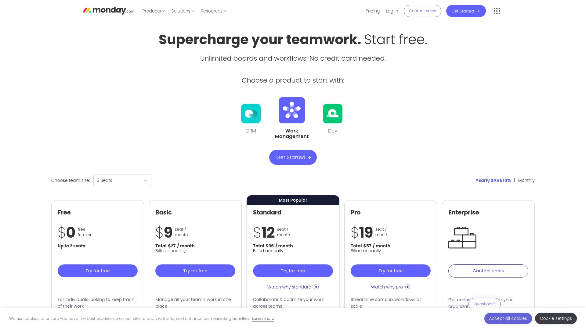
12. Monday.com Pricing Page
URL: Monday.com Pricing
Monday.com’s pricing page showcases a vibrant and engaging layout that aligns with its playful yet professional brand image. With four tiers — Individual, Basic, Standard, and Pro — the design uses a color-coded system that helps users easily identify their options. The clean white background allows the bold use of primary colors like blue, green, and yellow to stand out without overwhelming the user. A sticky header ensures that users always have access to Monday.com’s most important offers as they scroll. The page also uses interactive sliders and dynamic elements to let users customize the number of seats and see real-time pricing, a feature that enhances the user experience.
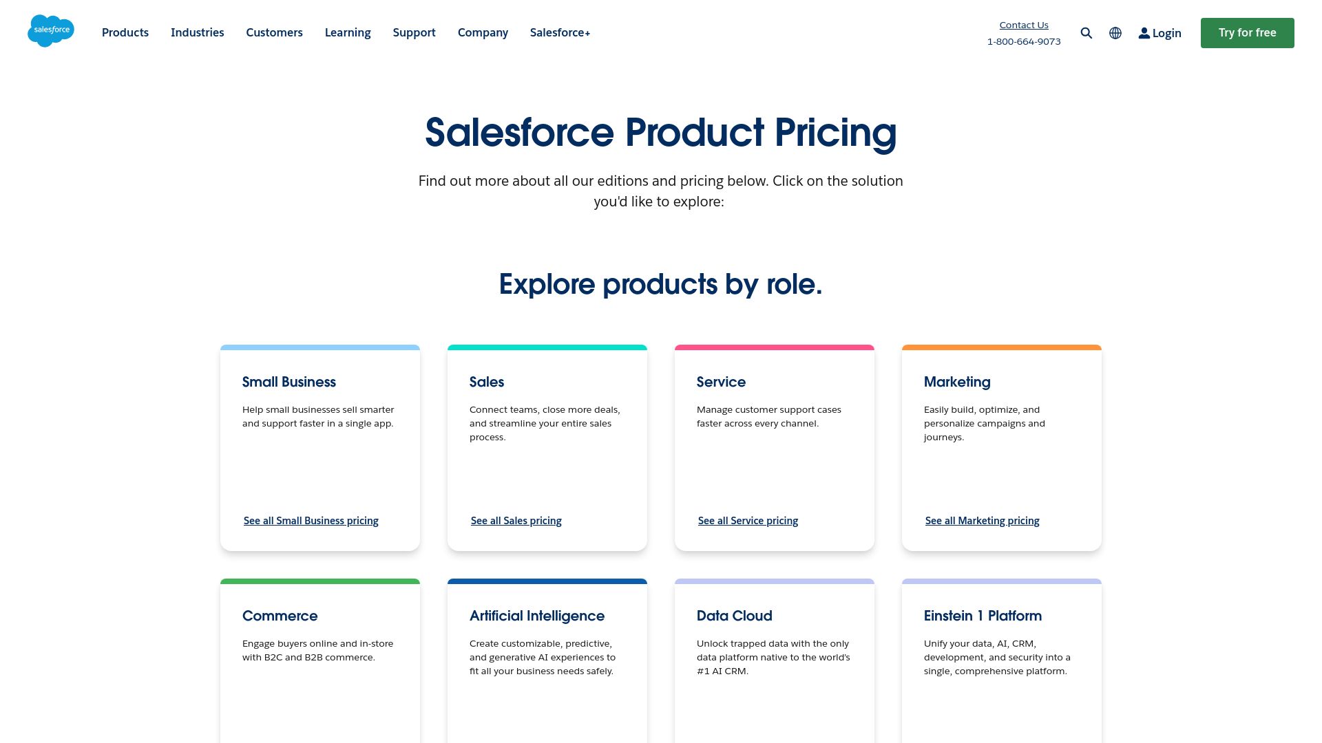
13. Salesforce Pricing Page
URL: Salesforce Pricing
Salesforce’s pricing page embodies the brand’s robust and professional character, offering various product categories and detailed breakdowns for each one. The design makes it easy to navigate through multiple pricing tiers across Sales, Service, and Marketing clouds. Each plan is presented in vertical columns with bold, dark-blue headers and white backgrounds that make key features stand out. Salesforce uses a multi-layered approach to its pricing page, including both high-level overviews and in-depth tables for users seeking granular details. This multi-tier strategy caters to both casual visitors and enterprise clients who need more comprehensive data before making a purchasing decision.
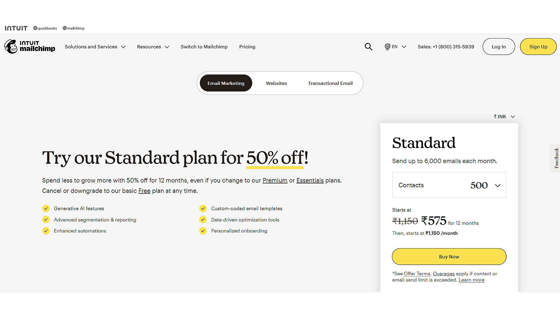
14. Mailchimp Pricing Page
URL: Mailchimp Pricing
Mailchimp’s pricing page offers a well-organized and visually balanced design that showcases its four tiers: Free, Essentials, Standard, and Premium. The use of white space keeps the page uncluttered and highlights the differences between each plan. The color scheme blends Mailchimp’s signature yellow and black with subtle gray for a modern and inviting look. The pricing is clearly listed at the top, followed by a detailed feature comparison table below each plan. The "Get started" buttons are boldly emphasized in black, standing out against the light background and guiding users towards the next steps in their purchasing journey. The page also highlights their free trial offer in a clear, non-intrusive way, making it easy for users to take action.
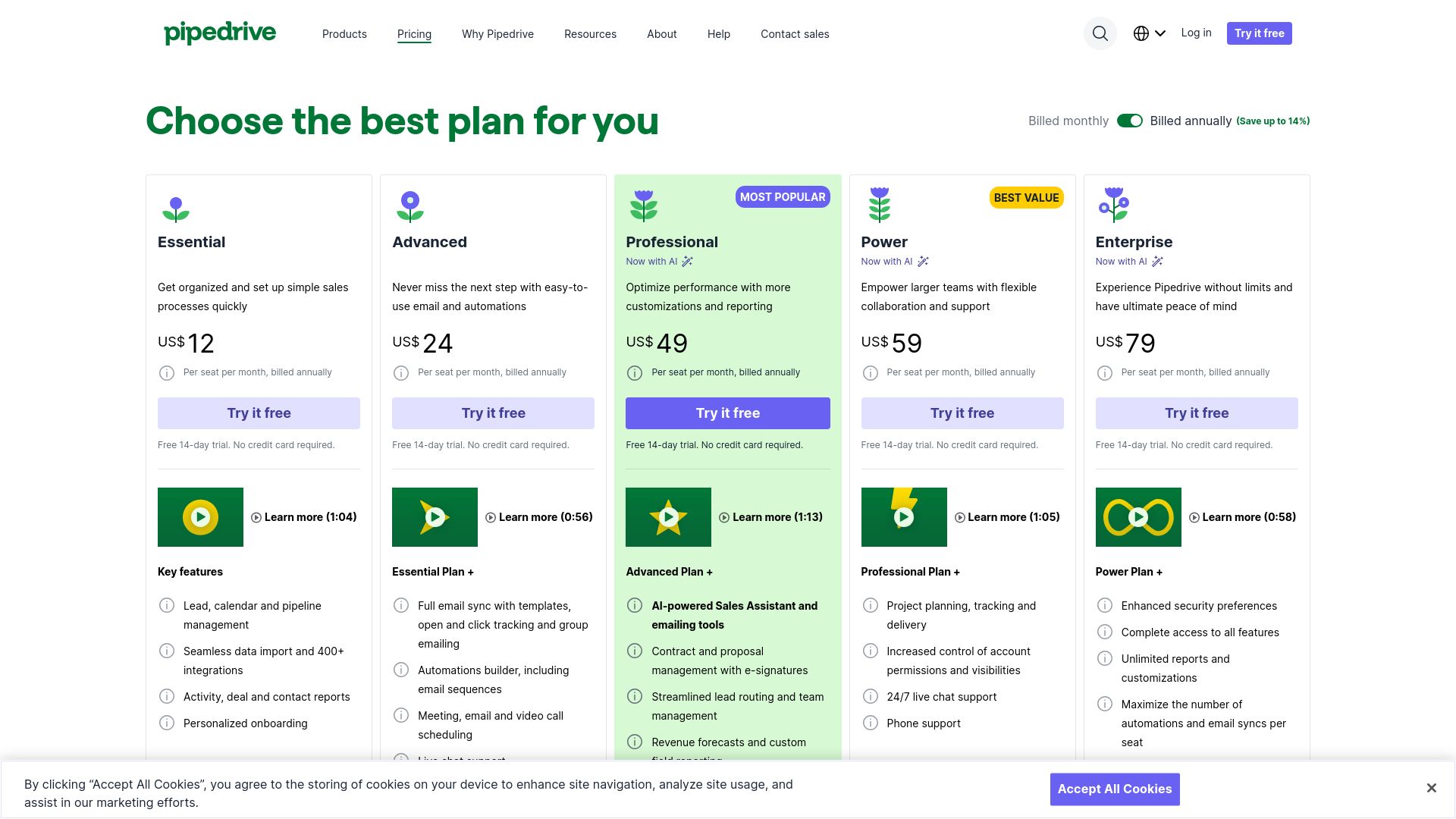
15. Pipedrive Pricing Page
URL: Pipedrive Pricing
Pipedrive’s pricing page follows a straightforward, user-centric approach, showcasing its plans with clear pricing, features, and calls to action. The design uses a four-column grid layout to display the four tiers: Essential, Advanced, Professional, and Enterprise. The blue and white color scheme creates a modern, professional look, while the use of green for action buttons directs users' attention to the next step. A comparison table sits below the plan cards, making it easy to contrast features and choose the best plan. The overall simplicity and attention to responsive design ensures that the page looks great on both desktop and mobile, making the purchasing process smooth.
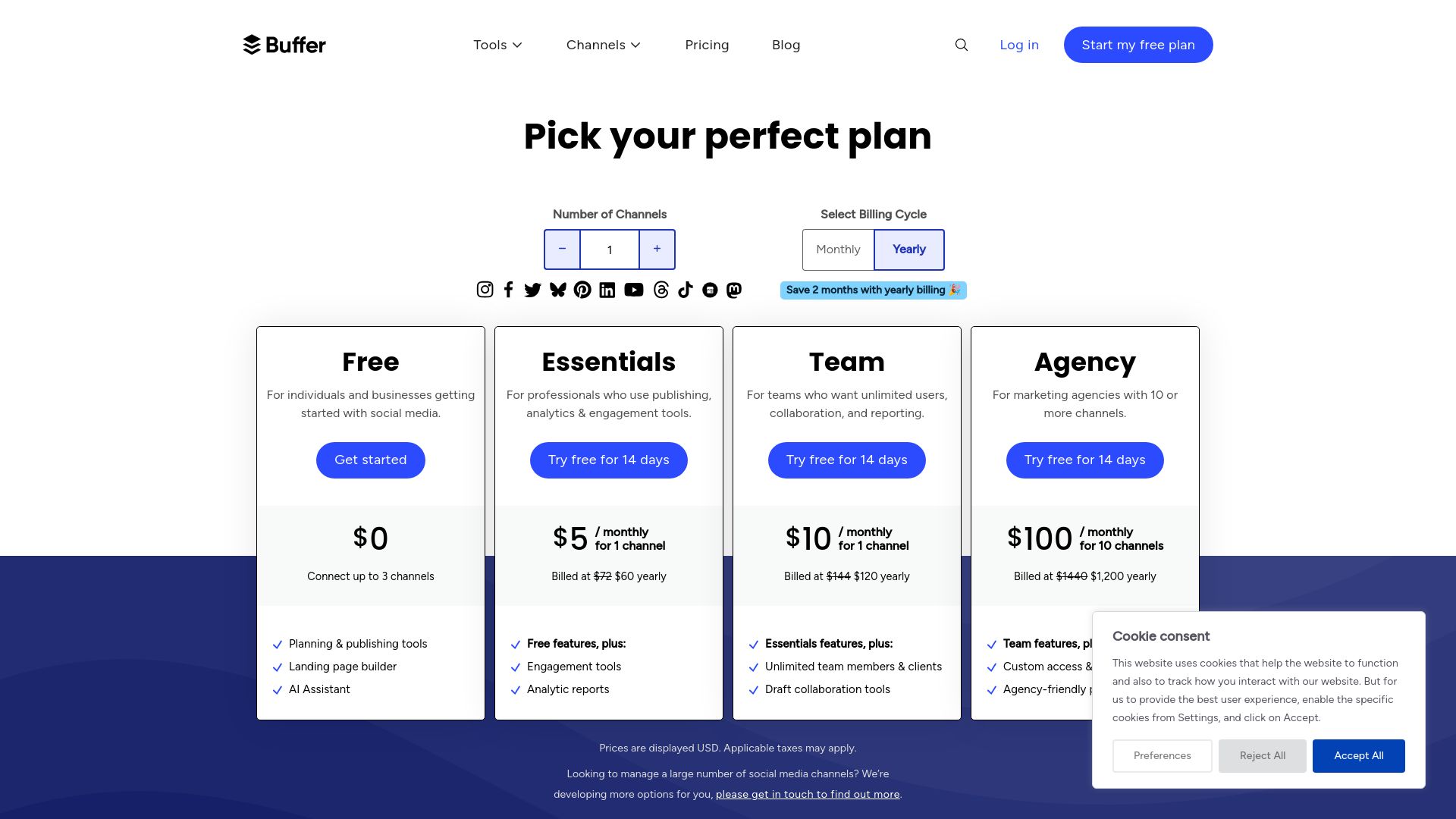
16. Buffer Pricing Page
URL: Buffer Pricing
Buffer's pricing page is one of the best SaaS pricing pages in terms of simplicity and transparency. It features three tiers: Free, Essentials, and Team. The page uses a clean white and teal color palette, with the pricing tiers laid out in vertical columns for easy comparison. Buffer emphasizes transparency by including the core features at the top of each pricing card and explaining in detail what is included in each plan. The call-to-action buttons are bright teal, making them easy to spot. The page is also designed to highlight Buffer’s value for smaller businesses and teams, with well-placed user testimonials and an FAQ section to answer any lingering questions.
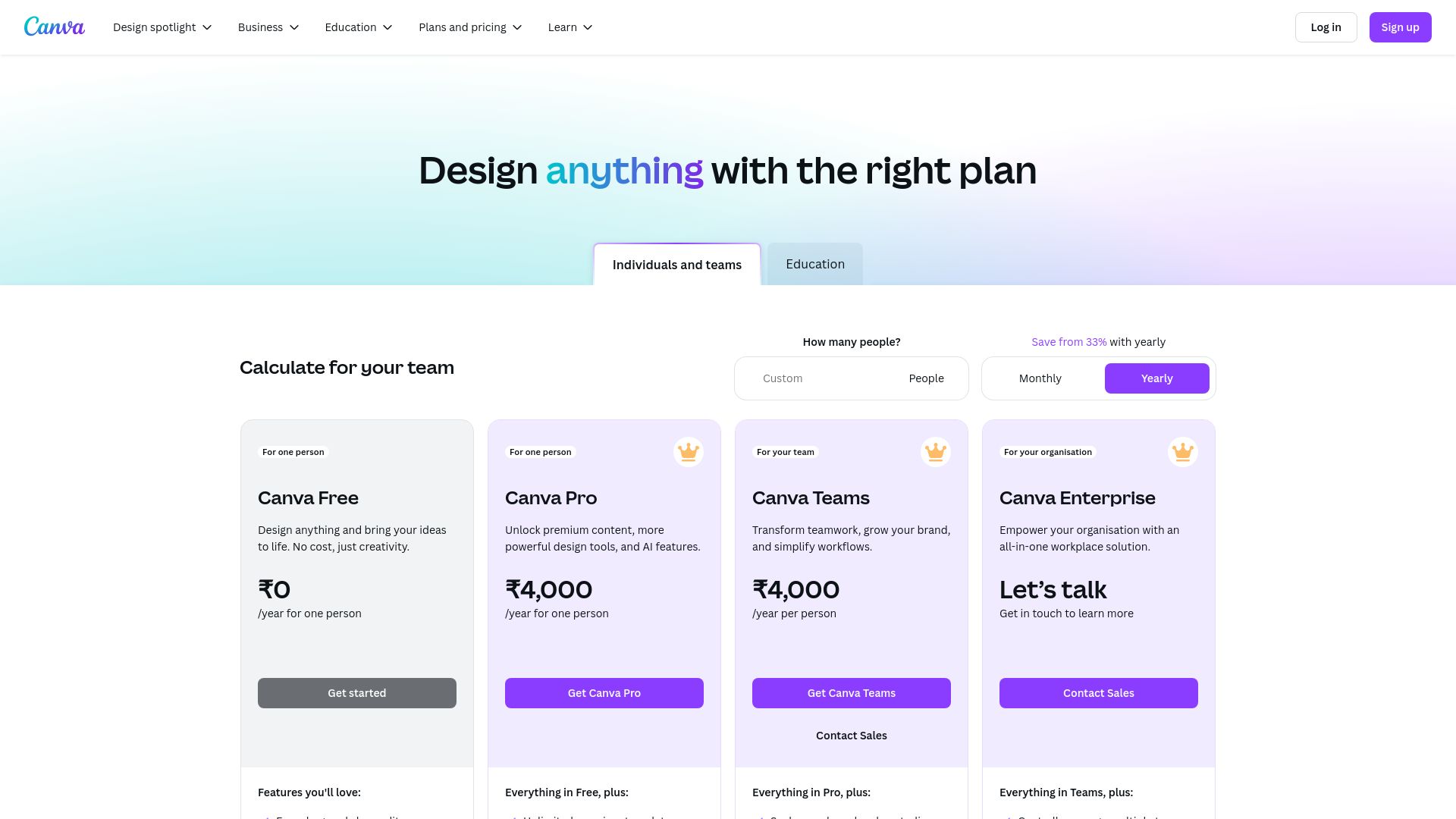
17. Canva Pricing Page
URL: Canva Pricing
Canva’s pricing page is clean, visual, and beautifully designed, reflecting Canva's brand ethos. The page uses a three-column layout with Free, Pro, and Enterprise tiers, each clearly demarcated by Canva’s signature purple, green, and white color scheme. The design places heavy emphasis on features with concise bullet points and icons to make the information more digestible. Canva includes a side-by-side comparison for each plan, with the most popular "Pro" plan highlighted in a bolder color. Large call-to-action buttons direct users to start their free trial, while a comprehensive FAQ section at the bottom provides extra details, ensuring users feel informed before making a decision.
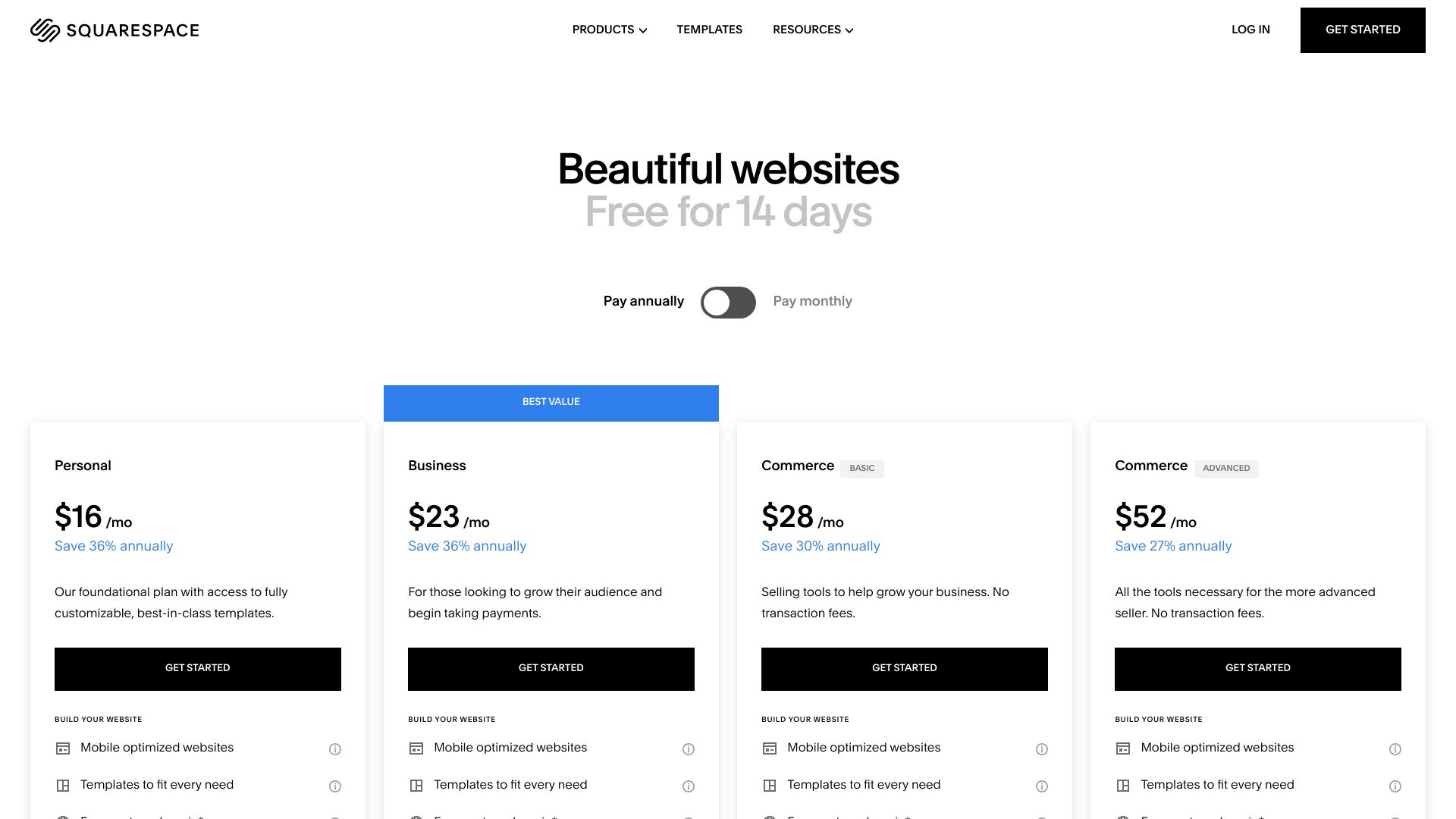
18. Squarespace Pricing Page
URL: Squarespace Pricing
Squarespace’s pricing page is sleek and elegant, fitting its minimalist brand image. The page uses a four-column design to compare plans: Personal, Business, Basic Commerce, and Advanced Commerce. The design is highly visual, using bold typography and plenty of white space to make the content easy to scan. Each plan card is designed with black, gray, and white colors, reflecting the brand’s modern aesthetic. Squarespace also includes a feature comparison table that is easy to navigate, allowing potential customers to quickly see what each plan offers. The call-to-action buttons are bold, drawing attention to the free trial offer and making the process intuitive for users.
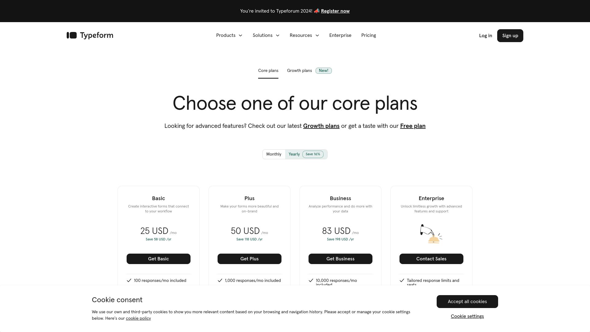
19. Typeform Pricing Page
URL: Typeform Pricing
Typeform’s pricing page is as user-friendly and engaging as its core product. It features a three-tier pricing structure: Basic, Plus, and Business, laid out in vertical columns with a clear focus on the most popular plan. The page uses pastel tones and a minimalist layout, ensuring it feels approachable and modern. Typeform emphasizes features and benefits with bullet points and small icons. The interactive pricing calculator is a unique touch, allowing users to customize their plan based on the number of responses they expect, which provides more pricing transparency. The call-to-action buttons are in bold, contrasting colors, guiding the user toward starting a free trial.
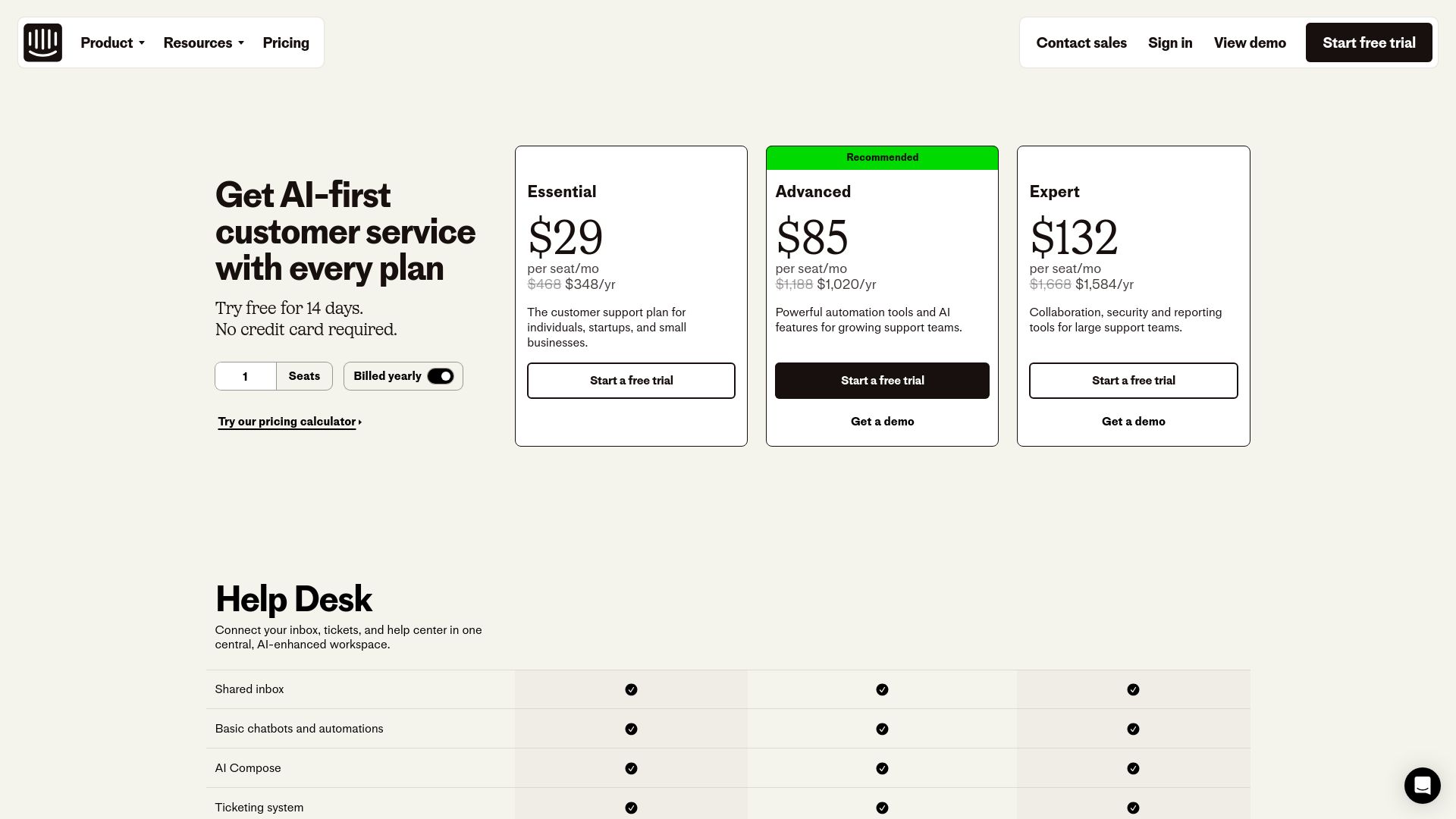
20. Intercom Pricing Page
URL: Intercom Pricing
Intercom's pricing page uses a multi-step approach that first asks visitors a series of questions about their business needs before displaying a tailored pricing plan. This personalized approach sets Intercom apart from traditional pricing pages. The design is modern and sleek, using a combination of blue, white, and gray tones, giving it a professional yet welcoming feel. Each plan includes a comprehensive list of features, with tooltips for additional explanation. The call-to-action buttons are boldly placed at the bottom of each plan, encouraging users to start a free trial. Intercom’s interactive and personalized design makes the decision process easier for businesses of all sizes.
About Prateeksha Web Design
Prateeksha Web Design Company is a leading expert in creating visually compelling and effective SaaS pricing pages. The firm offers 20 unique design inspirations that aim to revolutionize your SaaS pricing page, enhancing user experience and increasing conversions. The services include intuitive layout designs, strategic use of color and typography, detailed value proposition presentation, and easy-to-understand pricing tiers. Each design is tailored to suit the unique needs of your SaaS business.
Interested in learning more? Contact us today.

